Showing posts with label Women Who Create. Show all posts

Friday, 23 June 2023

ICAD Week Three Done!

Hello friends,!

Well, here's the next week of index card art. How quickly these first three weeks have gone by.  This year, I'm cheating a little bit. I'm not actually using index cards, but instead I bought a small book of not brilliant quality sketch paper. As far as the quality goes, it's not far off the poor quality of an index card. It's just that this is bound in a spiral book.  It contains 70 pages so that's enough to give me more than one page per day for the 61 days. And at the end of it, I'll have a small, neatly bound book of my artwork. So much more tidy than just a bunch of loose index cards that very often get separated out. And then I can't find them.

so here's the next round up.
 
Day 16/61  Alphabet


Day 17/61 Sunflower


Day 18/61  Xylophone


Day 19/61 Violet


Day 20/61 Tranquility


Day 21/61  Postage Stamp


Day 22/61  Unexpected


Day 23/61 Enchanted Forest


Until next time
Stay safe, stay well
Debbie xx

Wednesday, 16 November 2022

Ooops! I Almost Forgot . . .

Hello friends! 

I hadn't planned on posting another blog so quickly after the last one, however it suddenly dawned on me I had one major painting that I completed a few weeks ago that I haven't shared with you yet.  Also, I’m quite excited about the one I completed this earlier this week so I'm quite eager to share it with you. I mustn’t forget the eyes either!

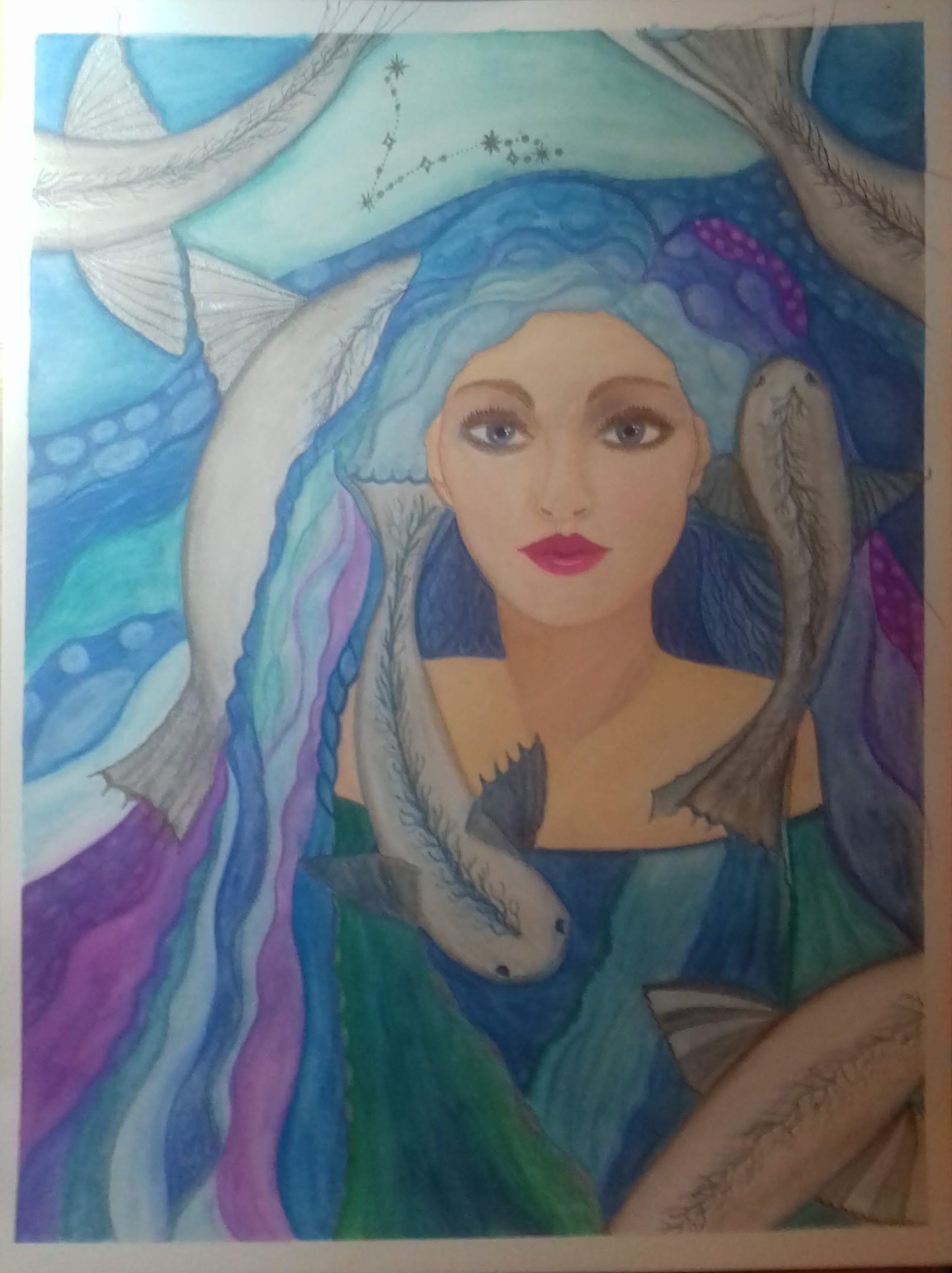
First, the one that is called Aphrodite in Pisces. A month ago, in October, Ida Andersen Lang hosted a free, online, ten day long, in depth, art class called Wish Upon A Star.  I think she is starting to do a series of Zodiac portraits as she has done one previously and hinted that more will be following. I loosely followed guidelines for it, while I enjoy her in depth lessons, one problem I have is she is very specific with her materials. I don't have a lot of them, and there isn't much room for improvisation, so I did the best I could with what I've got to hand. This is the end result. First a close up of the face, followed by the finished final outcome.

I think I've come a long way since I started out back in June with the 61 days of index card art challenge and culminated with this which is an A3, so I've gone from small pieces of work to much larger! This one took several days to complete and is mixed media using watercolour pencils, waterproof pencils, gouache, and shimmer paints.


Do you remember I also did a project called the Magic Eye of Ceridwen?  Here's a little reminder


Well, I enjoyed doing it so much that I've divided and A4 journal page into eight sections and I've started doing smaller versions in different colorways experimenting a little bit. I've only done four because I took a break to do some other artwork, so this is something I must to return to


Finally this is the piece I'm most excited about. I think it's become clear I'm really settling down into doing these portraits and I do enjoy them immensely, And one thing I keep doing is trying to push myself out of my comfort zone. Well this one certainly did that! I decided I wanted to try some different skin tones and this is the result. It's a single media using my box of sakura koi watercolours. I can't begin to tell you how difficult it was, nor how much I learned about skin tones which is immense. 


I've learned some new techniques, and my next project is going to be simply worksheets of mixing skin tones and blending them in different ways. I've discovered that you can use almost every colour, even blue, blended in different ways to create different skin tones, and that the more you blend colours rather than use them straight out of the tube or pan, the more natural skin tones you achieve.  Following that, I'll be working on sheets of eyes, noses, lips, and hands!  This is going to take a lot of practise and dedication!

Until next time
Stay safe, stay well
Debbie xo


Saturday, 12 November 2022

Two Goddesses of the Moon and Spring

Hello friends!

I'm excited to start out by telling you that everything in this blog is my own original artwork and not done or guided by any online lessons.

I promised one of my friends that I would share my process with photos. So here is the latest piece as yet untitled. I had my 4th Covid booster inoculation on Thursday and due to a serious underlying medical condition, I was advised to rest for Friday on Saturday even if I didn't feel poorly or have a reaction, which thankfully I haven't. So, I had to find something to do and decided that Friday I would paint another fantasy portrait.  I will be resting again today as it is Saturday and I'm still following doctor's orders. So quite possibly I will do another painting.  Or maybe bake a cake. That's not exactly strenuous, is it? Mind, I do need bread. Oh dear, this could get complicated.

As yet she's untitled, she is painted on and A4 journal 90lbs paper {which really should have been a lot heavier, see below***} and is in mixed media using Neocolours II, Sakura koi watercolours, gouache, shimmer paints, and Derwent waterproof pencils.

First I made an edge to the paper using low tack sellotape. You can see this more clearly on the second photo, where it is resisting the dark blue paint. Then I set in my image and used a compass to draw the circle which would later become the moon. Because I try and work intuitively at this point I hadn't finalised the design in my mind and was uncertain whether this was going to be the moon or a halo.


When I was in school, I was taught to paint the background layers first and work forward so that the top layer of paint is what is closest to you in your subject.  so I started with the background which I knew I wanted to be a night sky and I painted this in Neocolour II water soluble crayons.


Next I painted the eyes and lips using gouache. Normally I don't do the features until later but I'm finding that I'm losing the definition by leaving them until later, so this was an experiment painting them in early to see if I could help maintain definition.  We'll know soon if it worked or not.


She certainly looks fierce now, doesn't she?  I begin to question whether or not this this was the right thing to do. Have I ruined the painting at this very early stage? Only one way to find out. Onwards and upwards!


Next I started adding flesh tone in gouache.  Suddenly, her eyes seem a little less fierce.


I always build the colours up in thin layers so a couple more layers of flesh coloured paints and some more colour added to the eyes and lips and she's starting to look much better. That fierce look has now been muted and knocked back.


Sadly, I do feel I have lost some of the. Definition around the eyes, nose, and lips. They are not my strong point, and I must practise more.


 At this point I have to decide is that circle behind her going to be a silver moon or a golden halo.  So, working intuitively I roughly block in the colours for her hair and her dress.  I can tell immediately that gold is not going to work so silver it is and we have a moon in silver shimmer paint.


The final outcome, with which I am happy.  However, I may add some spatters of white paint on the dark areas of the sky.  Hopefully they will add a an extra. air of magic to the painting.


Here is another one I did last week, it's in the same journal {as the one above, and is also mixed media. I wanted to have a little play with my gouache and inktense paints just see how they interact and basically just to get a better feel for how to use them, so that is the mixed media for this one.  she started out life as a doodle I'm just kind of grew from there, organically and intuitively.  I didn't want to draw hands. It's not something I've done yet, and I didn't want to ruin the piece with ugly, badly drawn hands as it was developing well. Consequently, she's holding a bouquet of flowers!

Is something extremely wistful and maybe melancholy in her expression. I feel she has a story to tell, don't you?


A couple of people have asked me what is mixed media. Basically, it's anything where you use more than one type of medium. So for example if I paint a picture using my koi Sakura watercolours that is a single medium work. However if I introduced even just one more elements of medium, for example watercolour pencils, then it becomes mixed media because I have used more than one medium. Some mixed media projects are quite elaborate because people use all sorts of things in their work, not just flat work which is what I tend to do.  I hope the people who asked are reading this and I hope I've made sense.

*** I know I should be using better quality paper than 90lbs, mainly because of the amount of water that is used and the absorbency of the paper, but after all I am just learning and starting out on this painting journey and it's easier on the wallet to make mistakes on cheaper paper than it is on the 140lbs, or 300gsm weight paper that I should be using.


Until next time
Stay safe stay well
Debbie xoxo


Saturday, 15 October 2022

LifeBook Taster Sessions part 2

Hello friends!

This finishes up what I completed during Life Book 2023 taster sessions. It's been a while now, since I've not made art daily. I started on June the 1st with two months of index card art. That was followed with Artful August. Then there was Ida Lang Andersen's Artist Soul Gathering. And finally, Tamara Laporte's Life Book.  It's a lot of art!

I'm still making art. I've no plans to stop now until I can no longer hold a paint brush. October is my birth month, and I will be treating myself to some new art supplies for my birthday.  I am going to get, amongst other things, some professional quality watercolour paints. I haven't decided which brand yet. I think I'd like a set of half or quarter pans rather than tubes. Some of the brands I'm looking at are Daniel Smith, Schminke, Windsor and Newton, and Daler Rowney.  I already have cheaper watercolours, student grade as their known.  Basically, while they are still good quality, they're not as highly pigmented as the professional quality. And there's also the factor of being lightfast. Lightfast means if you hang your painting on the wall, the colour won't fade in a few years. Light affecting pigment is one of the reasons many galleries have subdued lighting.

Recently, someone asked if they could buy some of my work. Unfortunately, I had to refuse, because they have been made as the result of a lesson, and copyright of the images is not mine. However, this offer is why I have to seriously consider painting anything in the future using professional quality paints.  I would not feel comfortable selling something that wasn't made to professional standards.

I have also had someone offer me NFT's for artwork. But I have no idea what these are, and I have no intention of getting involved.

The next lesson I did was Tamara Laporte's "Butterfly Queen". It got a bit out of control with brightness, so I had to knock it back quite considerably to where I could look at it without wearing dark glasses!!!  I changed the symbolism to Christian by placing a Celtic cross design on the forehead instead of the more Pagan style used in the demonstration.  This lesson came at a time of year when I mark the anniversary of the passing of both my parents just three weeks apart. The fact that it includes butterflies seemed very appropriate at this time, because butterflies symbolise rebirth.
I used Neocolours, Derwent paint pens, and Brushos.

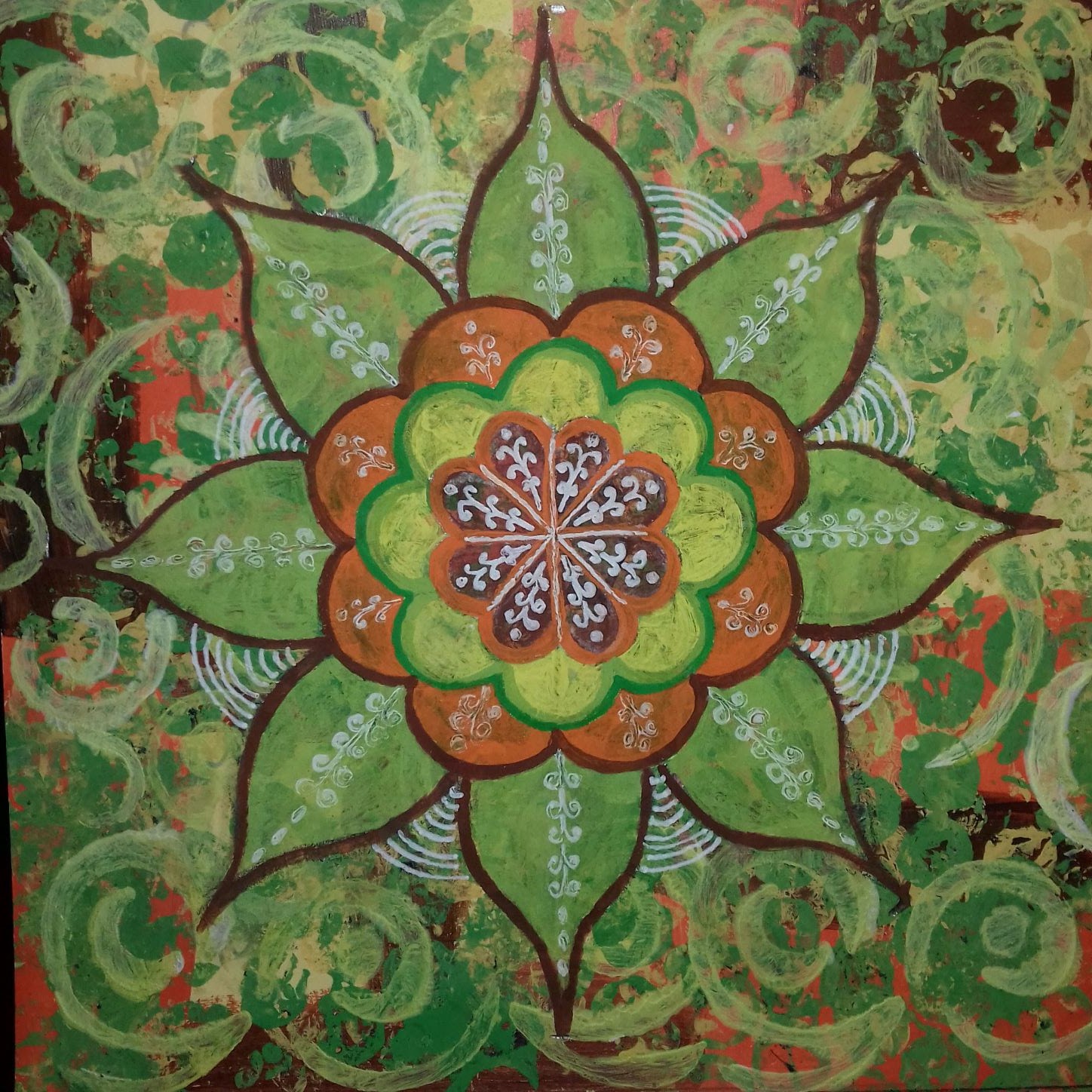
The next lesson I did was Mindfulness Mandala, hosted by Angela Murray, 
a superb class. I really enjoyed the freedom that this gave, taking me way outside my comfort zone of not being perfect. 
Mixed media.

I have struggled somewhat with the white lines but am working through it.  So, I did a second one to test my new ideas.  I gave this one as a birthday card/small gift. It was very well received. 


I'm not altogether sure I'm done with this one yet. I wanted to do one in autumnal colours. I do like the vintage feel that the colours have given.


The colours in this one didn't turn out as I'd hoped, but it's all a learning curve. I learned two new things making this one. It's all good in the end. Not as bright as I'd hoped it would turn out, though.  i am pleased with how well the free hand drawn circle turned out.  


So my friends, that pretty much sums up as far as I got this time. I didn't do as much as I'd hoped. But then I've been busy with other things. There are only so many hours in the day, and I'm struggling to get the garden ready for winter. And that has to take priority now. Next week I start another course. It's hosted by Ida Anderson Lang. It's a ten day long course, but we only produce one piece of work, so it'll be interesting to see how that goes. I'll let you know later.

I'm hoping to start sharing work and progress on the garden soon, but in the meantime. I'm taking measures to try and improve my fitness and hope in the near future that I will be starting to go out and about on short rambles again. Maybe a mile or two with the camera. I want to get us back to normal as I possibly can, while I'm still able to.

Until next time.
Stay safe. Stay well.
Debbie xo

Monday, 3 October 2022

LifeBook23 and a Garden Newsflash

Hello Friends! 

I started the Life Book 2023 taster sessions. There are a lot of lessons offered every day, from different artists who are guest lecturers, so it's a case of pick and choose which ones appeal the most. Or in some cases, the ones that I have the time to do.

Some of the lessons appear to be very short in length, however, for a novice artist there's a lot of stop and pause the video to catch up on the piece you are working on. The professional artists can work at speed. I cannot. I would guess that for every hour of video clip I watch, I'm doing at least two or even three hours work.

I chose to do Tamara Laporte's Blessings of a Feather. I decided to quit while I was ahead. I made the mistake of pausing the video to work on an area and I blithely carried on working forgetting to turn the video back on. It just kept getting darker and darker. I reached a point where I thought if I don't stop now, I might just as well rip it up.  My spatters aren't perfect by a long way. They're not as easy as you'd think they are. It's all about getting the paint to the right, consistency, and then having the courage to shake the brush by tapping it against your hand over the painting to get all the lovely spatters. It's also all about knowing when to stop. I'm getting there.


Next I did, in the style of Toni Burt, "Memories". I enjoyed this immensely and took what I learned from the lesson and applied it to one of my favourite arch combinations in the Bishops Palace, St Davids. Drawn from my own original photograph.


Then began the dry spell and nothing grabbed my attention in LifeBook for a few days. All the lessons were way too long for me to think about doing. I was given a big bag of pumpkins the other morning. So inspired by one of them, this is my art for today.  Acrylic "watered down" with gel medium.  I really should have put something in to give it a bit more context. But I was tired. And ready for bed.


Something I'd like to share with you is the importance of lighting in your photography. This is the first first photograph I took of my painted pumpkin.  It's hard to think that the photo above and the photo below are of photographs of the same image.


It was taken in the evening under electric light with a flash. The one above was taken the following morning in daylight with no flash, the difference is incredible. The one taken in natural daylight without the flash is by far the better photograph and represents better represents the pumpkin painting. The second one taken under electric light is flat and the colour is completely different. It is nothing like the original painting. The following photograph closeup shows the shading. There wasn't a lot of shading on it in the original reference photo, and this is reflected in my painting as I tried to remain true to the original photograph.


Reference photo.


This is as far as I can take Andrea Gomoll Wunsche's lesson "In Tune With The Moon" because I don't have a printer and her finished piece includes printed text. At some point I can handwrite everything out and finish it. I found it didn't work out well using acrylic paints but it was a decision made because I have a lot of white acrylic paint, and I'm getting low on watercolour. However, it was drying out far too quickly and didn't blend as good as I would like it to. Still, it's a learning curve.


Song of the Selkie in the style of Lucy Brydon I really got a lot out of this lesson. Painting skin tones in greens and blues was quite a challenge as I've only just started painting portraits a few weeks ago. I really enjoyed this lesson immensely. I've learned quite a lot as well.


At the moment I'm at a grinding halt with LifeBook, which in general is not appealing to me at all. I have enjoyed doing the pieces that I have shared in this blog. It is my intention to pursue those further. I have seen two other guest lecturers work that, again, I would like to pursue but each one will take me a full day of sitting at my art table, and at the moment I just don't have that kind of time to spare. It is a shame they are presented so intensely for a taster session. Speaking to my fellow artists, there are many of us who share this opinion.

I still have lessons by the following artists that I'm hoping to complete. Melanie Rivers. Ida Lang Anderson. Tiare Smith. There are two or three others, but I can't remember their names right now. We also have another the week to run on this taster session, so I'm sure there will be a few more names added to my list.

!!!NEWSFLASH!!!

I am hoping that I have found somebody to come in and help me with the garden. We have a volunteer group here called the Befrienders who help people who need help They might do things like shopping, or they might do telephone befriending, or they might just pop in and have a chat and a cup of tea You put your request forward to them, and if they've got somebody interested or able to help you, they come to your aid.  I asked them if they had anybody who might be able to come in and help me clear and tidy up my garden, because to be honest, since my diagnosis, the garden has run away with me. I am quite ashamed of the state it is in and hope that with the help of these kind people I can get it back in some sort of semblance of order, if nothing more than getting it tidied up to put it to bed for the winter. And productive, of course.
 
Until next time.
Stay safe. Stay well.
Debbie. xo

Friday, 30 September 2022

ICAD part six

Hello friends

You may be relieved to learn that this is the last instalment of index card art for this year. It's taken me awhile to share it all because I've been so busy with all the other art I've been creating.

I've put three photos. For this first image, because the paint is so shimmery, it just doesn't come across with a straight facing forward photo and I really wanted to try and show you the proper full effect of the shimmer.


The rest of these photos are all mixed media.

The first two are working dry watercolour crayons onto a wet background and letting it all bleed out.


The rest are all mixed media collage. Mostly based around one large scrap of tissue paper, which I managed to stretch over almost all of the cards. 


Many of you know that I take part in this index card art challenge every year. However, this year has been very different. There was no big index card art group on Facebook. However. I joined with a very small number of fellow artists. And we shared our work within our small group, which was very nurturing and supportive. We've helped each other along the way to learn and explore new techniques and new ways of creativity. It's been great fun, and we've stayed together since.

Show my friends that concludes index card out for 2022. Thank you for looking at the mall and thank you for your kind comments and support.

Until next time 
Stay safe. Stay well.
Debbie.

Tuesday, 27 September 2022

Fantasy Portraits Makeover

Hello friends! 

I've really been enjoying creating some fantasy portraits lately. Here are some more.

This first one is a reworking of a previous one I've shared with you. I didn't like the lips. They were too big. They were too red. They were too bold. They were like a slash of fierce red lipstick across her face. It did not bode well with me. In the meantime, I've been taking more online classes, and one thing I have learned is that gesso is quite a miracle medium, in that you can use it not only to stabilise your substrate but also to wipe things out. So guess what I did? You've got it. I just gessoed over those dreadful red lips and painted some new ones. Hurrah.!

In order, first is the original. The second one with the lips gessoed over.  The third one, the final amended one.  I used pink ink instead of paint for the final one.  I also added eyelashes, which is some facial feature I do need to practise. However, I think they've given the eyes an extra lift. And I also slightly reworked the shading in the eyes which is something I have learned to do since I painted this originally. Altogether, I'm very happy with the improvements made. I'd really like to know what you think. 


The lips gessoed away, makes me think of a horror movie where a spell is cast and mouths are sealed with web like bonds, but which one, I can't think.


I'm not going to pretend it wasn't scary. It was utterly terrifying!! However., I plucked up the courage and committed to it. I don't know how I did it, because it was frightening putting that first layer of gesso down over the lips, knowing that I could easily ruin everything with no going back. It was at work down the drain so to speak, but I think it's paid off dividends and it's a much better portrait all round now.

I may have mentioned that I subscribed to Tamara Laporte's. Life Book 2019 but because Mum passed away, I didn't even begin it. Once you've bought one of her classes you have lifetime access to all the components, so I've decided to go back in and work through the lessons.  Because I bought at the early birds price, I also got a free bonus class. It's called Garden Fairy; this is my result. I'm very happy with how it's turned out.

One thing I have learned is once you have set down your original line drawing and start applying your paint it can be quite a daunting process. I'm sharing just a few of the stages here with you to illustrate what I mean. To be honest once I start laying in the flesh tones, they really look quite frightening, as if you've ruined it before you've even started, but you just got to keep the faith and keep going.  Layer upon layer of paint builds up gradually and you hopefully end up with a finished outcome that you're happy with.

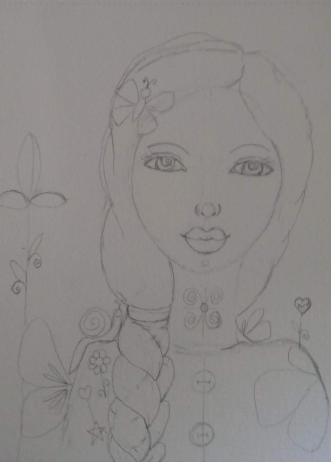
So, I create my drawing, with which I'm very happy.


First layers of flesh tones, and I already feel it's ruined. This is the point to keep going.


Now I'm terrified. What have I done?  Keep the faith. Keep going.


Then as soon as I start adding features, the colour of the eyes and the lips, it all calms down again.


Final Outcome

I'm showing you two versions of the same painting. First one is without the vine leaves hanging down in the background. The second one has the vine leaves added. I'm not sure which one I prefer. I can't make up my mind whether the hanging vines are a step too far or whether they add something to the portrait.  That's the thing with taking photographs at every stage of development. You get to see how things looked and compare. Photography can be a very useful tool with painting analysis.  I am very happy with how she turned out, either version!  Do you have a favourite?


Just bring everything up to date before I start on the taster sessions for LifeBook23. That is a fortnight of taster sessions with various artists similar to the previous one, Artist Soul Gathering, I did with Ida Lang Anderson.  I have already started it.

Until next time.
Stay safe, stay well.
Debbie